
Looking to choose the right men’s color? This might seem like an overwhelming task. Businesses have to consider which color will improve the business while meeting customers’ demands and current trends. So how should businesses go about choosing the ideal range of men’s colors for customers thus bringing in more sales? This article will assist guide sellers and businesses on how to make the best selection regarding which men’s colors to introduce to specific markets to grow business. Let’s get going!
Table of Contents
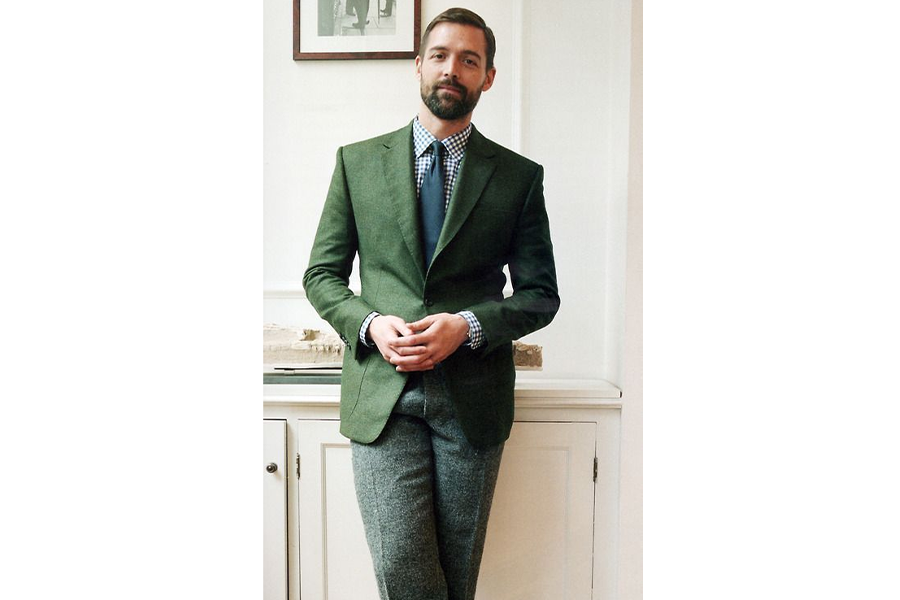
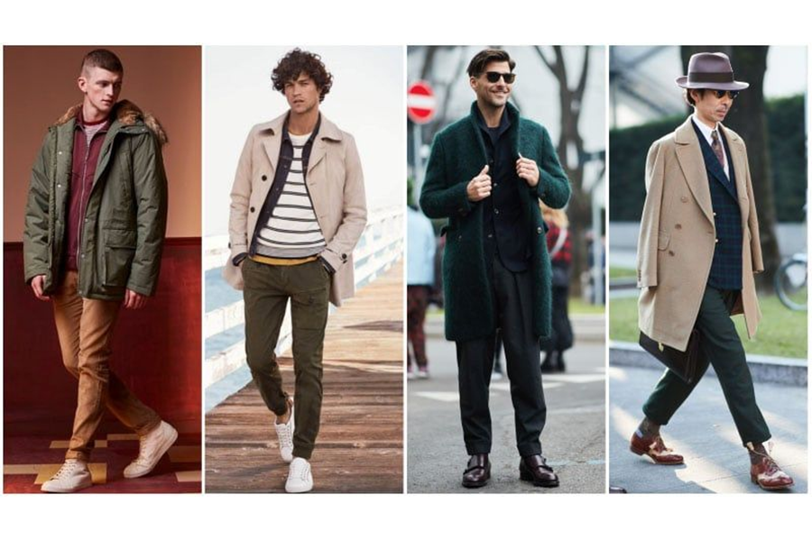
Closet planning according to colors
Trending colors for spring/summer 2022
Selecting the right tones and shades
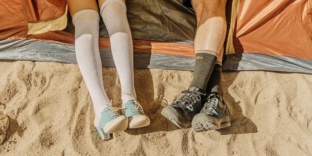
Closet planning according to colors
The men’s palette is divided into two portions. Firstly, there are enhanced and purified natural-looking choices or secondly the soft and earthy everyday tones. This will add up to having a pleasant appeal in clients’ closets.
- Up-styling core colors will be crucial to success in the current normal, both in product stock rooms and in consumer wardrobes. Some of the color schemes in this study are based on primary hues, with brights tweaked to fit in.
- Using trans-seasonal color– colors have become increasingly versatile and stable throughout the year, from autumnal browns to tropical darks to dusty pastels. Engaging new and existing customers will be more about exploring and offering various end options.
- Make color emotive – We’re all familiar with the calming effects of natural colors and mellow neutrals. Still, with gaming and virtual shared areas providing 24/7 lockdown escapism, crisp artificial brights are a great way to tap into a growing sense of confidence.
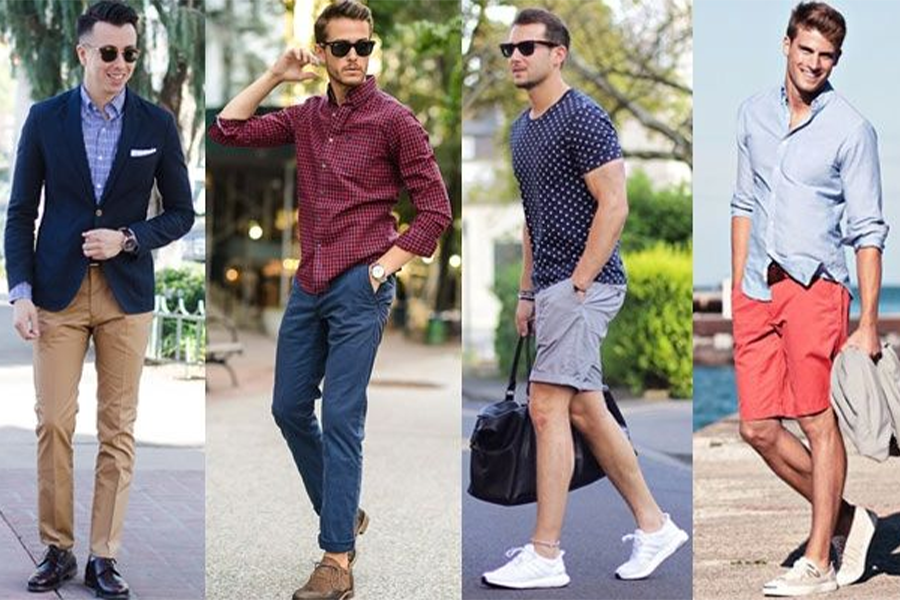
Trending colors for spring/summer 2022
Men’s color scheme
The color palette for menswear is inspired by nature, although spring/summer 2022 is divided into two portions; enhanced nature and everyday pleasure.
Enhanced nature
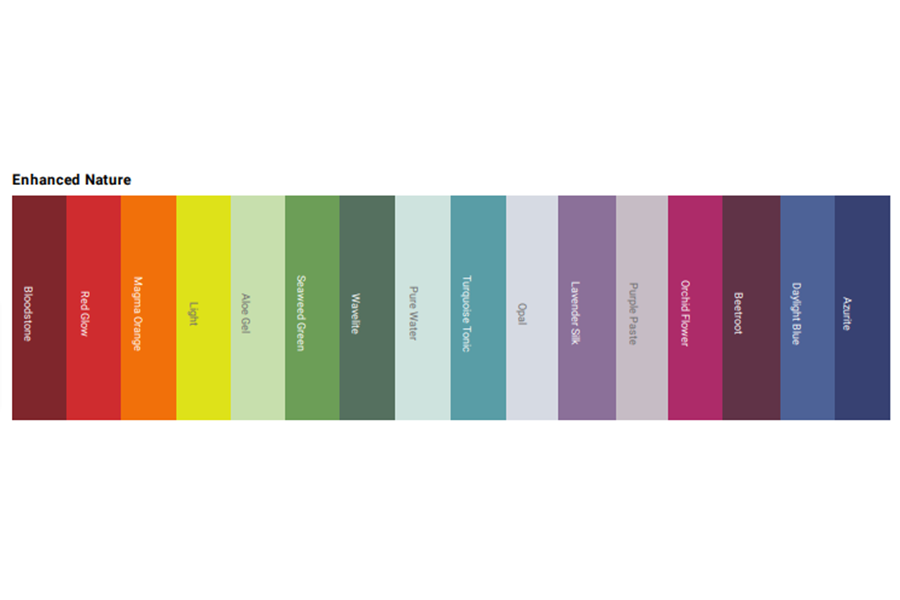
Enhanced nature displays immature hues that have been purified using a digital lens.
Everyday pleasure
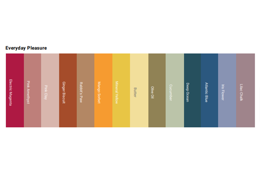
Everyday pleasure is a soothing and earthy color palette with a grounded and timeless appeal.
Elementary color choices to make
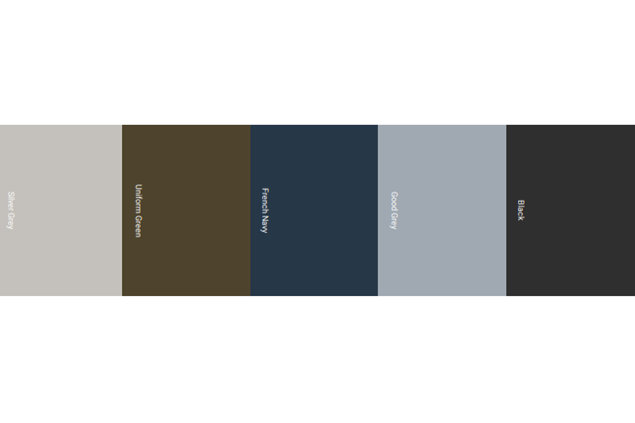
These are the ten key colors that will have a commercial impact in spring/summer 2022, serving as a basis for the primary palette.
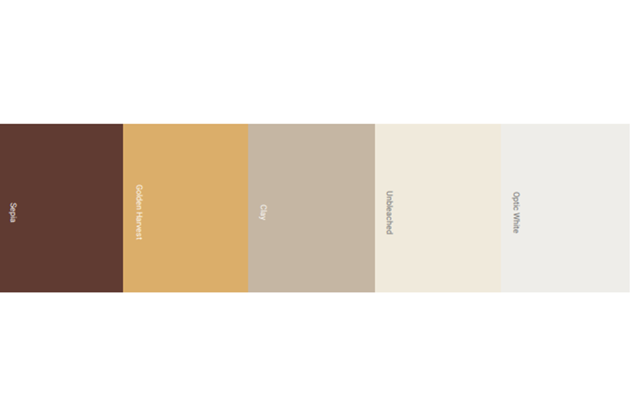
Sepia and Golden Harvest capitalize on browns’ rising trans-seasonal appeal, while cooler utility tones serve as a backdrop for the season’s dusting pastels and brights.
Selecting the right tones and shades
Adding the spark of green
Spring green adds a pop of color to newly cleaned neutrals. These delicate colors and neutrals carry ongoing “stay at home style” ideas with vibrant energy, suggesting the fresh light of spring. This goes well with both indoor and outdoor attire choices and is elegant and soothing.
Purple Paste, Opal, and Clay create a soothing commercial backdrop for freshly cleaned wovens and jerseys, while Iris Flower and Rabbit’s Paw take a more practical approach. For a contemporary and exact contrast, use Seaweed Green and Aloe Gel.
Brighter hues with a tangy touch
Combine bright orange with bright pastels for a cheerful look. These pastels reflect a more colorful image of the future that is founded on the sense of self-expression, whether realized or via online gaming groups and social spaces, by presenting positivity and joyful zeal.
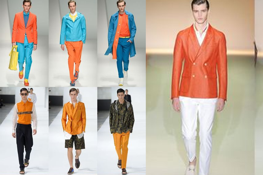
With a selected design that refreshes existing preppy and Americana motifs, these flexible pastels advance on the color clash of recent seasons. This creates a curated aesthetic appeal that is anchored by Golden Harvest and Deep Ocean.
The classic blend of brown and blue
Deep blues give technical browns an enigmatic edge. Brown’s resurgence as a fashion color hasn’t slowed down, thanks to its year-round appeal.
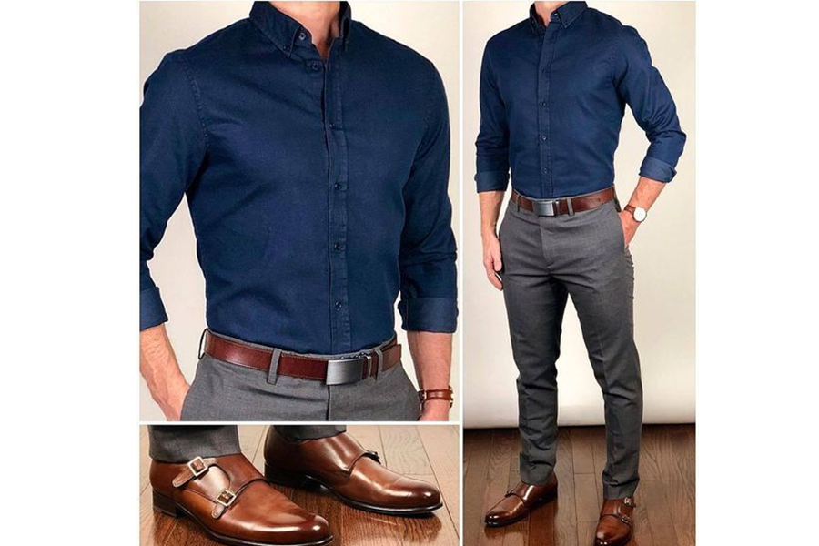
On the other hand, it eschews nostalgic connotations in favor of a more forward-thinking design that capitalizes on expanding tech wear and future utility themes.
Pungent browns, olives, and khakis form an appealing foundation for a precise outdoor aesthetic infused with a sense of magic, which is accented with touches of mineral blue and turquoise.
Brighter tones on the go use of strategically placed brights in austere classics gives them a new lease on life. Accessible brights have become a vital upgrade in the gap between sporty and casual design as minimalist motifs continue in the setting of increasingly reduced and modular wardrobes.
Aim for a crisp, clean aesthetic with a balanced graphic sense, with the more expensive blues and reds generating a playful and purposeful contrast with the perennial core colors of black, optic white, and uniformly green.
Brighter tones of red
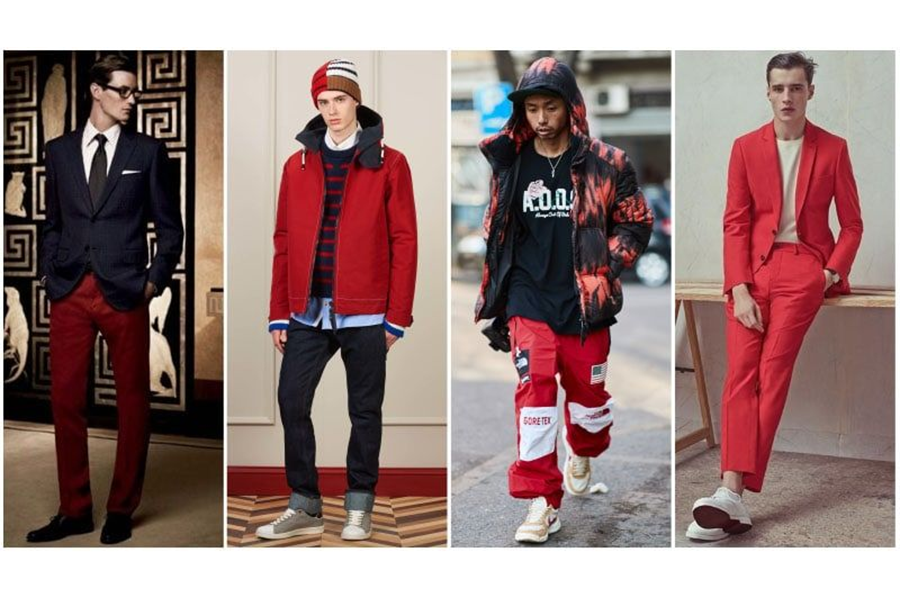
The outdoor motif is energized by hyper-active colors. With cheery psychedelic undertones and a hyper-active mindset, these hues give a brighter perspective on the home hub and women’s clothing minimalism, moving into the outdoor sports realm.
With an essential blend of basic pastels and neutrals that can be enlivened with the brights, this is a palette of two parts that can be dialed up or down. Mango Sorbet offers a practical accent but with a warmer, brighter touch.
Dark tones and bright shades on the same page
The core darks are illuminated by digital brights. The theme of colorful tropical darks has become a common feature in current palettes, thanks to its adaptability in consumer closets and counter-seasonal marketplaces in the southern hemisphere.
These cool digital brights are the perfect highlight for a more technical look that mimics neon and UV club nights, especially since fundamental hues like navy and black aren’t going anywhere.
Neutral colors for a decent look
The use of sophisticated neutral colors creates a new sense of timelessness. As the concepts of timelessness and durability grow with time, a greater emphasis on styling will encourage a more complex and unique approach to core color use.
This palette’s slight contrast conjures up images of recycled uniforms, where legacy meets craft and color meets texture to keep things fresh. Wavelite green updates olive, while Atlantic blue introduces denim motifs.
Pink and purple, an all-time classy combo
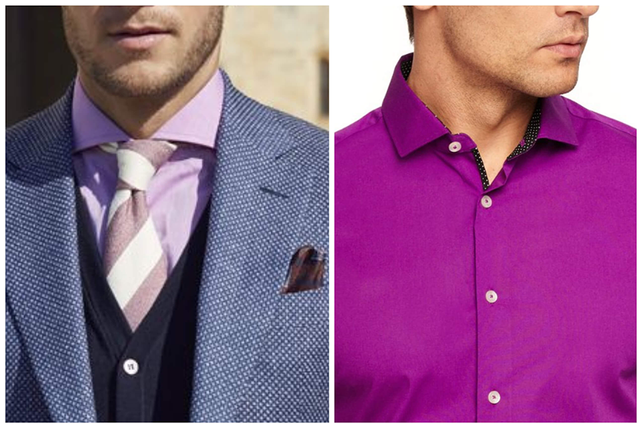
The use of valuable pinks and purple in outdoor style gives it a new lease on life. Pink’s prominence in the menswear industry isn’t going away any time soon. Pink, lilac, and purple are reintroduced as part of a more practical palette in this chapter.
A nomadic luxe design that leans on outdoor and soft masculine themes is anchored by black and uniformly green, ginger, and lilac mid-tones.
Mineral Yellow combines with Electric Magenta to create energetic flashes for dynamic contrast and detail.
Pastel colors never leave the trends
Dusty pastels will help anyone look more put-together. Pastel has now become increasingly adaptable, appearing to be a reliable year-round option, such as dusty pastels that seem to adapt to changing lighting and weather conditions.
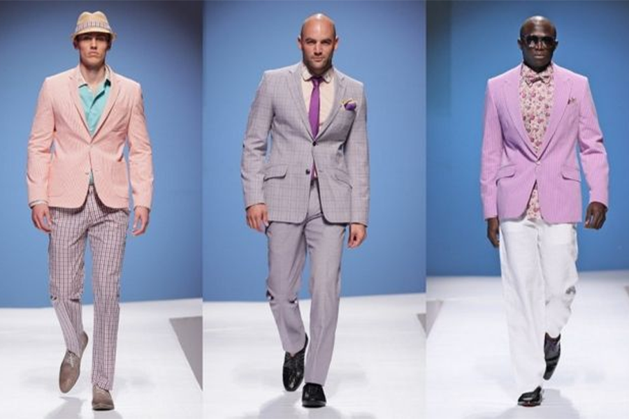
This color is ideal for Americana themes, college sportswear, and more sophisticated preppy designs. Use these colors with slick surfaces for a carefree, youthful vibe, or contrast with black for a tougher ethnic tone.
Conclusion
To enhance and grow your business, you should understand the colors that most men are drawn to; everyone has their color preference. Keeping in mind all of the colors discussed in this article, you can rest assured that your company will flourish.

No comments for ali baba everything is 100% I LIKE ALI baba products
I like the offers
C’est super la palette de couleurs pour homme c’est une bonne tendance aussi pour les homme
ALi Baba est une belle application j’adore les offre aussi et c’est pas Cher non plus tout pour satisfaire les clients 👍😜
I have some things l need to pay for.like some jackets l need to order threw you guys.how do l do the payment thing…for what l need to order